Culture and Society
 PUBLISHED


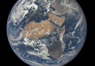


Today, the world will make a decision on how it chooses to portray itself: stick with the troublesome Mercator map of the globe or switch to a new projection of the planet that shows the countries at a more true size and scale.
The UN General Assembly is set to vote on Friday on a resolution spearheaded by Africa calling for the world to officially phase out the traditional Mercator map in favor of the "Equal Earth" projection, or another similar map that depicts the size of Earth's continents more accurately.
The effort, known as “Correct the Map”, was submitted by Togo on behalf of the African Group, a bloc of 54 African states, with backing from the African Union.
Their aim isn't to dogmatically tear down the old map. Instead, the draft text seeks to actively encourage the use of the "Equal Earth" projection in international organizations, educational tools, and tech platforms.
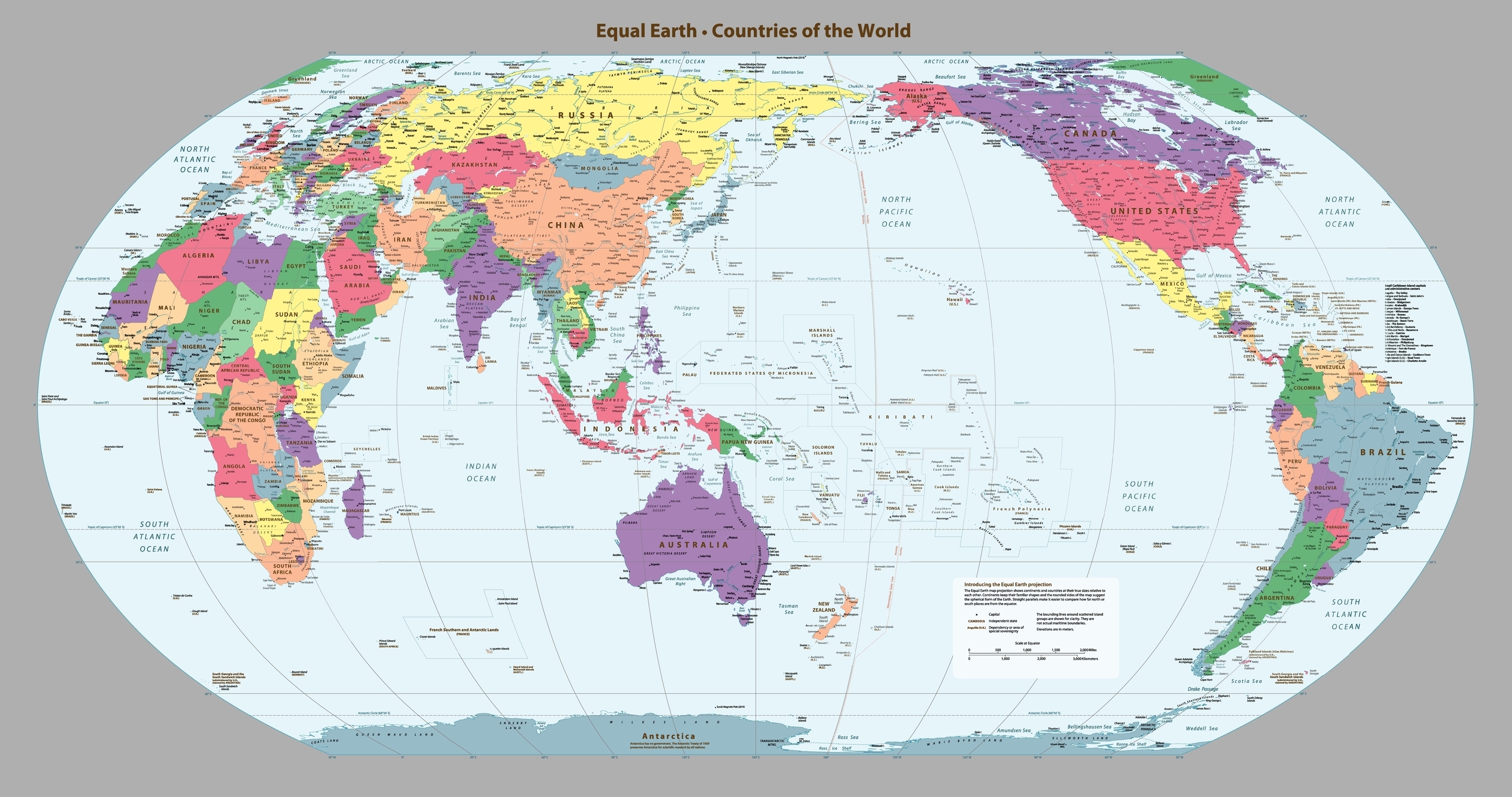
"Correct The Map"
The map most often seen in school classrooms, textbooks, and media reports is the Mercator projection, created by the Flemish cartographer Gerardus Mercator back in 1569.
It's a cylindrical map projection, in which you place the globe into a cylinder and then project each point of the map onto a corresponding point on the cylinder.
However, portraying a three-dimensional planet on a two-dimensional plane is tricky because you cannot flatten a curved surface without making compromises. Imagine peeling the surface off a globe and laying it perfectly flat on the floor – rips, tears, and crumbling would be inevitable.
To work around this geometrical difficulty, the Mercator projection distorts the sizes of landmasses. While preserving the true shapes of countries, regions near the poles appear much larger, while areas near the equator are shrunk.
One of the biggest victims of this distortion is Africa. You wouldn’t be able to tell by most maps, but the African continent is large enough to fit the US, China, India, Japan, Mexico, and a handful of European nations. Likewise, the Mercator projection makes Greenland appear similar in size to Africa, even though the latter is actually 14 times larger than the former.
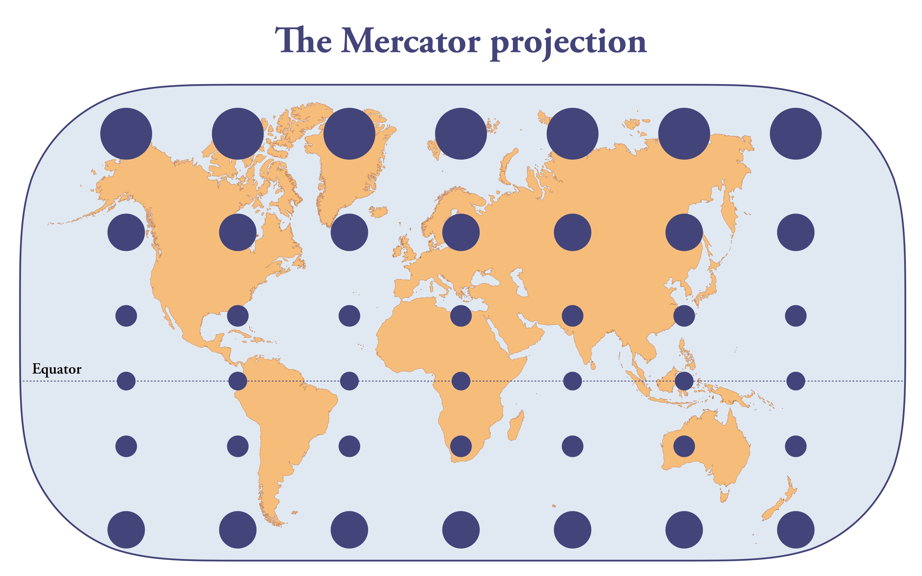
Africa's beef with the Mercator map projection
Many argue the distortion is more than a cartographic flaw, but a symptom of geopolitical biases and colonial history.
The Mercator projection inflates the presence of North America and Europe while shrinking Africa and the Global South, reinforcing a Western-centric view of the world that downplays the significance of the world beyond the North Atlantic.
“This is not merely a technical or academic question. A map is never neutral. It shapes perceptions, influences how the place of peoples and continents in the world is understood and may, sometimes from the earliest years of schooling, perpetuate representations that do not correspond to geographic reality,” Robert Dussey, Togo’s foreign affairs minister, said in a statement.
“Our approach is not directed against any country, continent or cartographic tradition. Nor does it seek to impose a single interpretation of the world. On the contrary, it advances a constructive ambition: to strengthen scientific accuracy, promote informed geographic education and foster a more inclusive vision of our planet."
In 2025, the African Union backed the campaign to replace the Mercator map projection with proportionally accurate alternatives. This week, that project will see just how far it can go on the world stage.
“Tomorrow will therefore be an important day for the African continent. It must be an expression of our unity, solidarity and determination. Africa is not asking for preferential treatment. Africa is asking that its reality, aspirations and contribution to the international system be duly taken into account,” added Dussey.
Bear in mind, however, that no two-dimensional map of the planet will be perfect. While the Mercator projection distorts size, it's pretty good at representing the shape of countries and landmasses. Other alternatives, like "Equal Earth," have to make their own compromises. They might be good at portraying scale, for instance, but not so good at accurately preserving shape.
Whatever map the world chooses, there will need to be compromises.